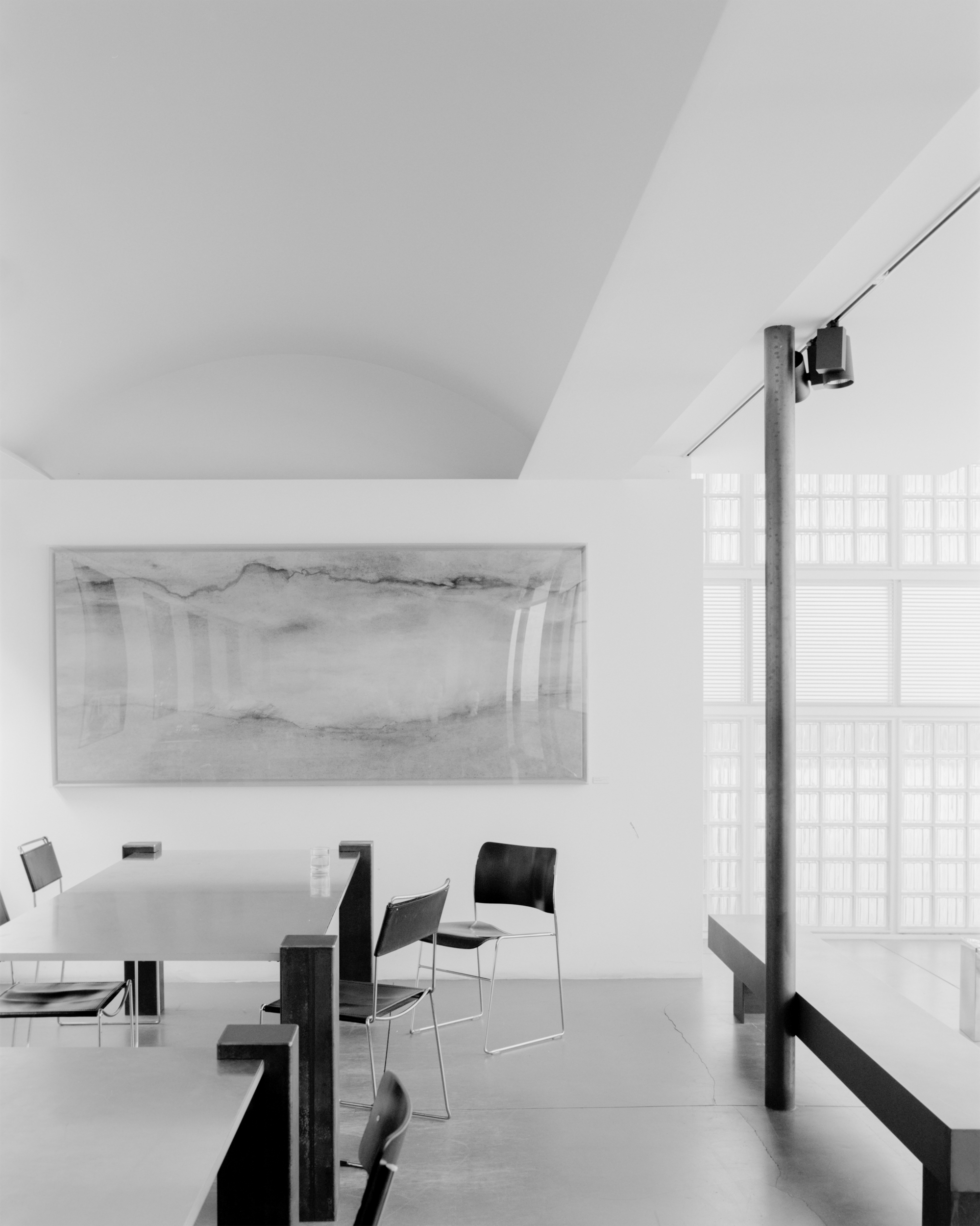
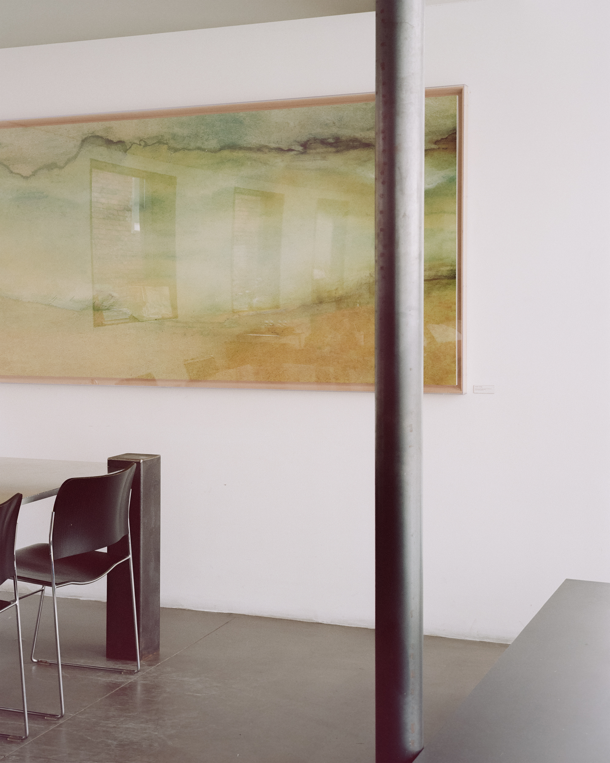
Layer10 project sits on the right-wing of the masterplan which is a big conversion project of a 60-year-old factory building clusters. The masterplan is to convert old buildings into photography studios and a small coffee place. 3ab was in charge of remodeling the small cafe part that summed up to about 100 square meters.
We aimed to project unique ‘aura’ into each space scene. The scenes were intended to be unfamiliar every visit. For the intention we considered two different aspects. Adjustment of proportion and add of new material was one, re-shaping of interior space was the other.
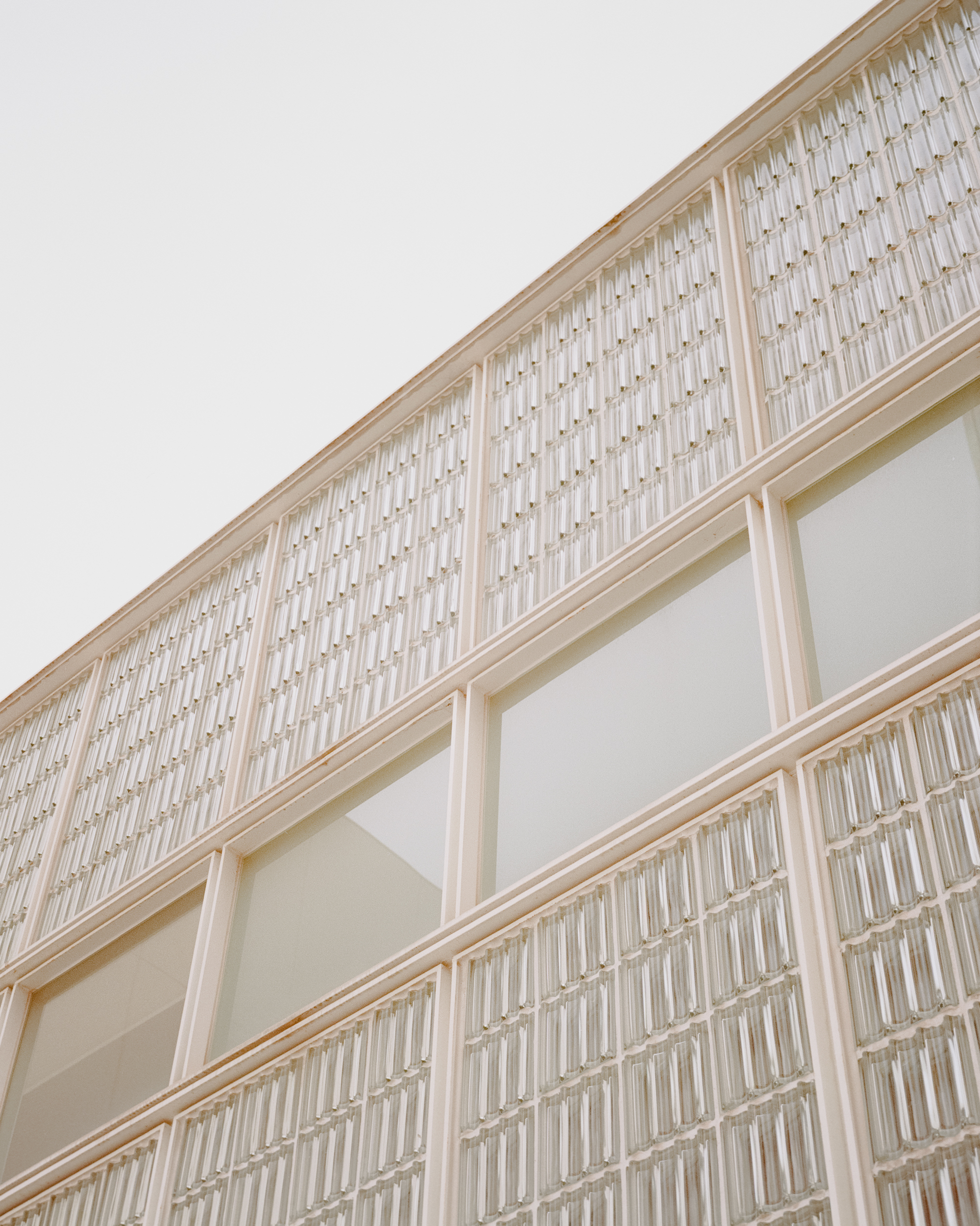
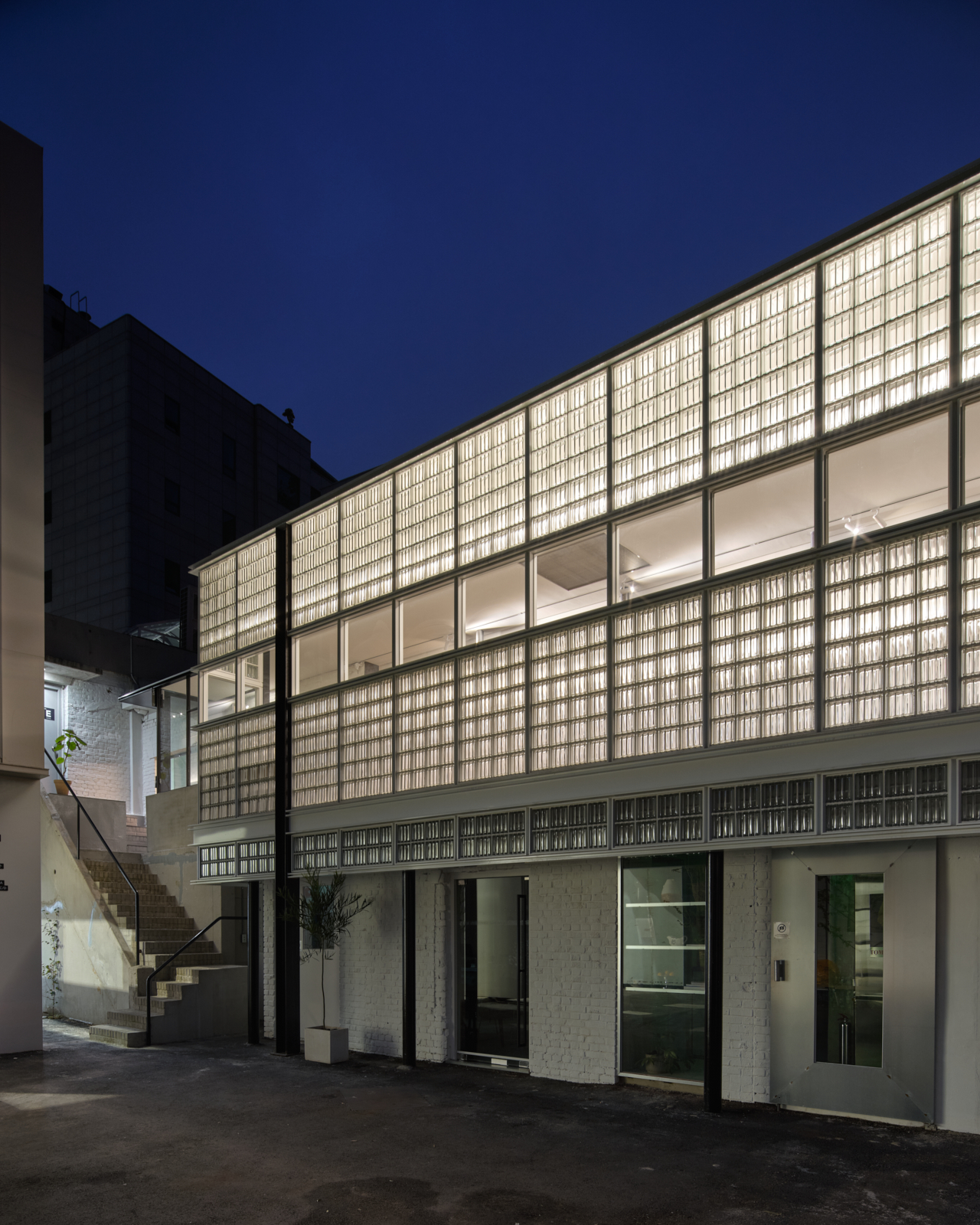
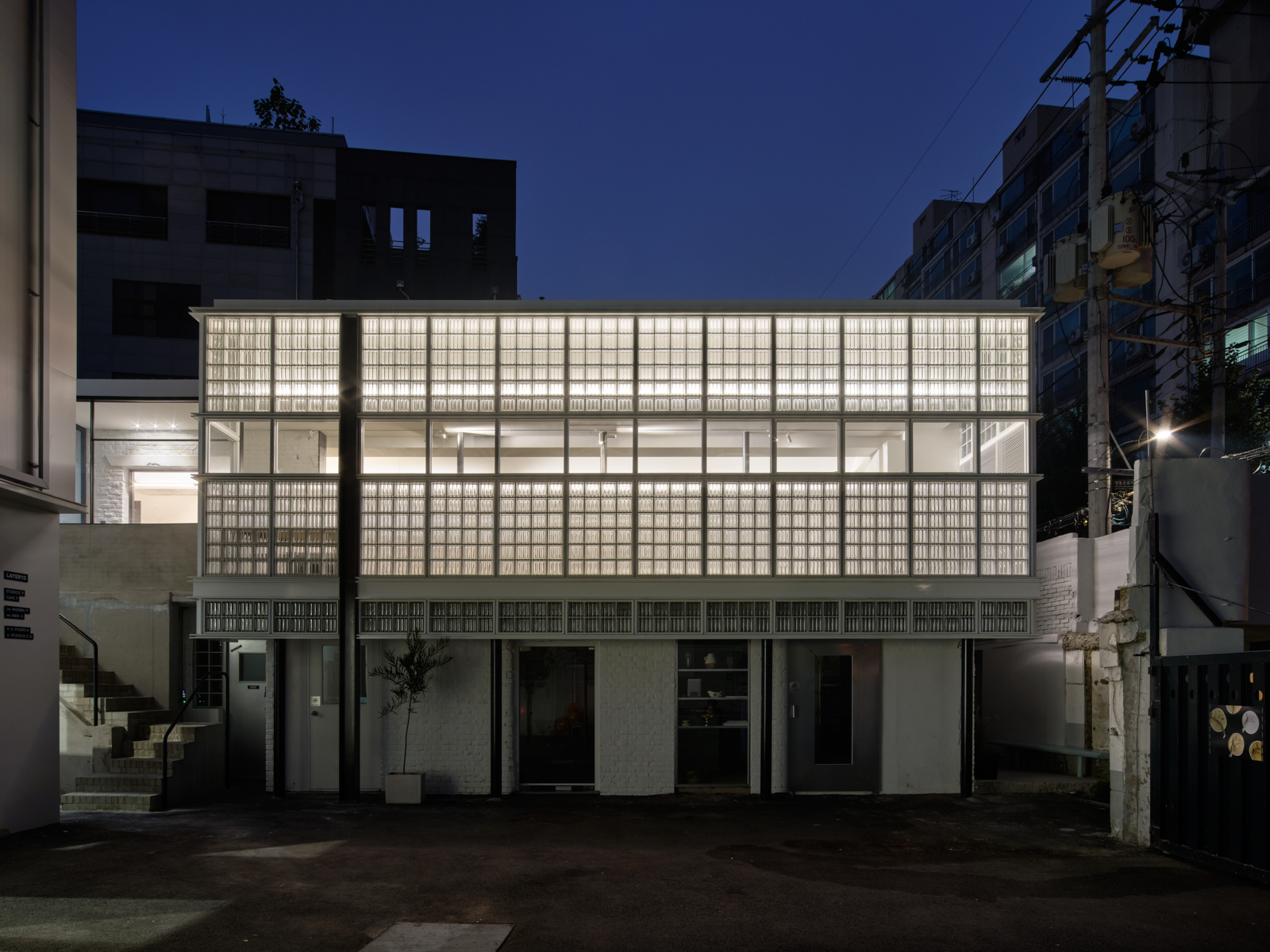
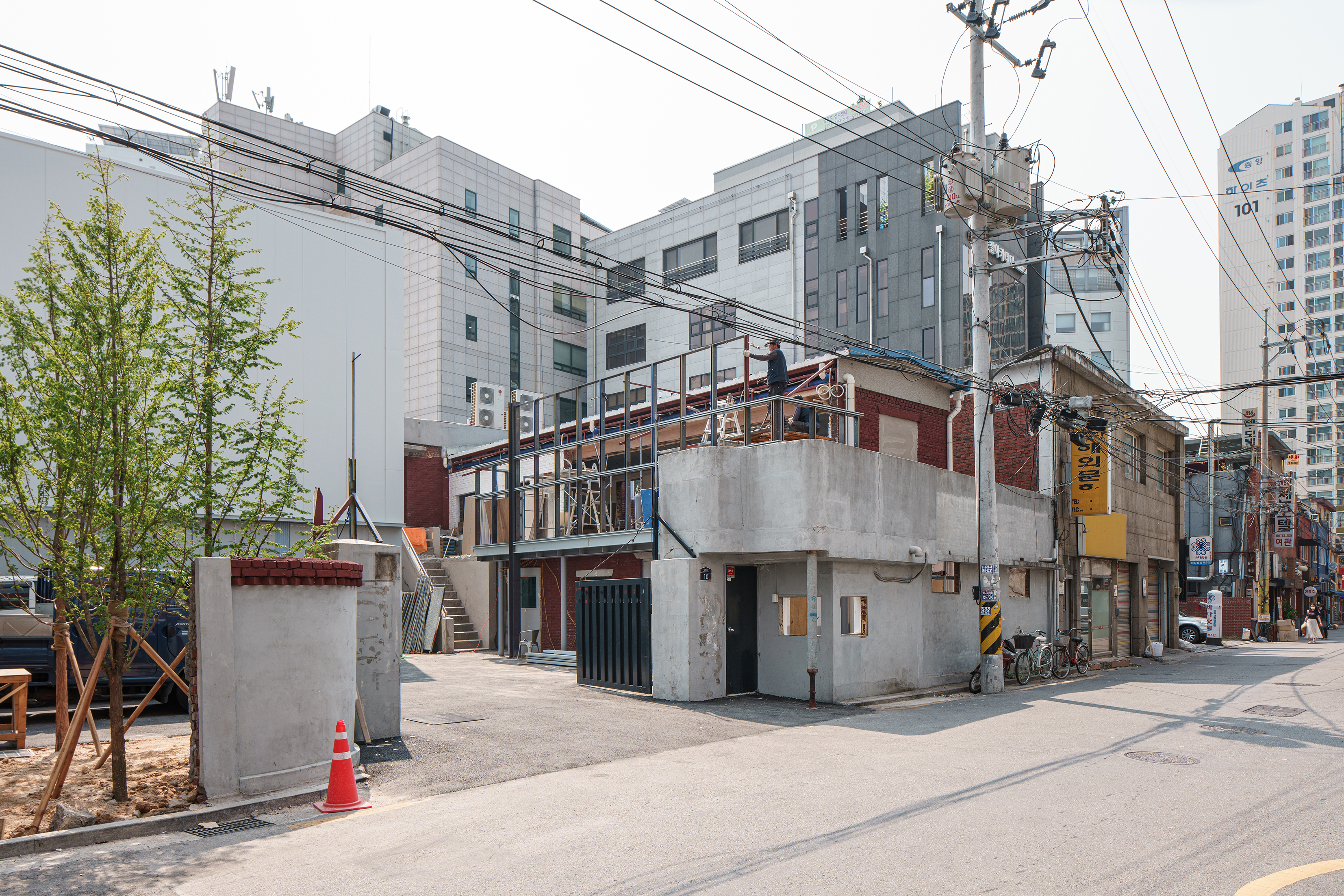
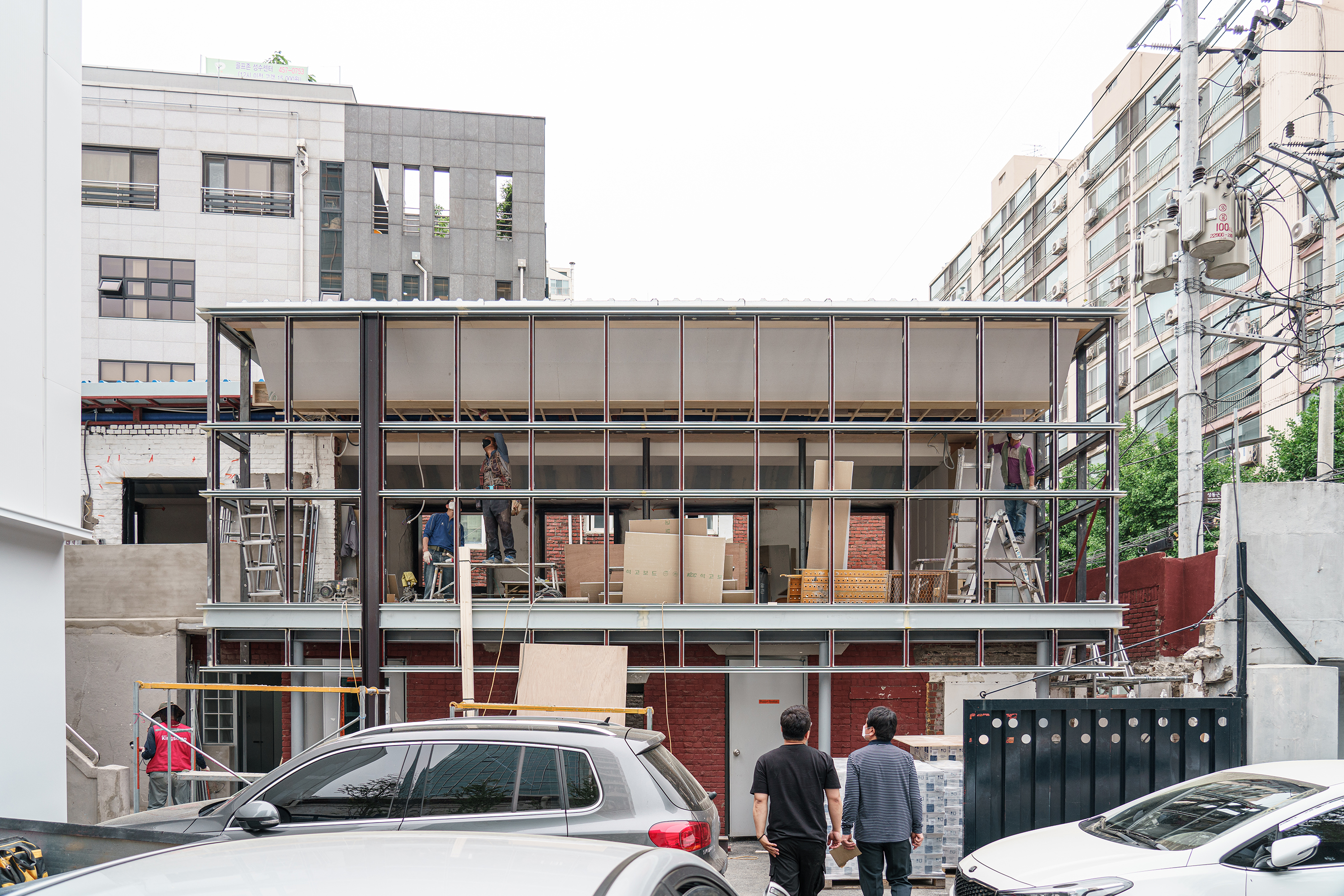
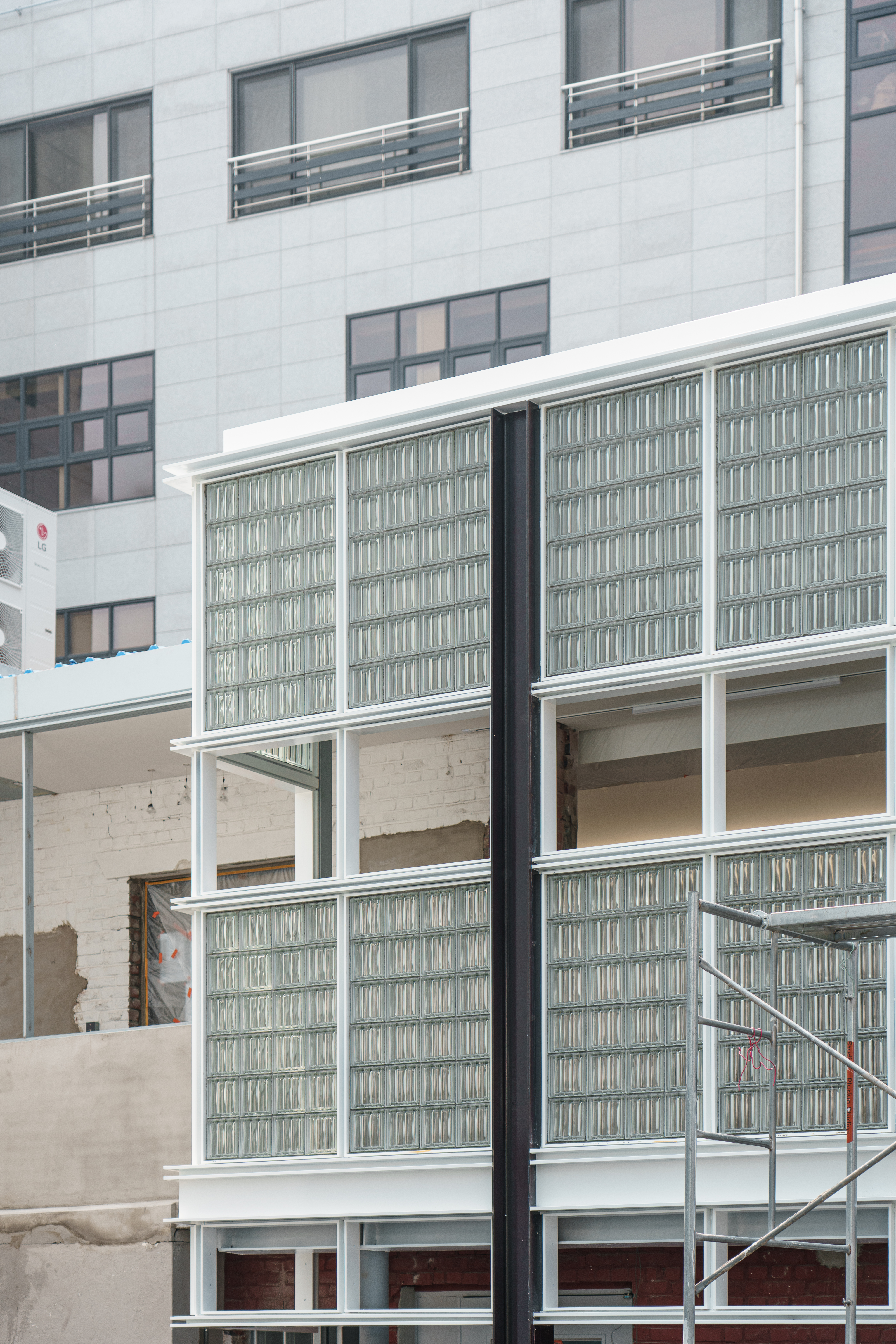
Facade design was at the top of the list. Awkwardly proportioned sandwich panels in the existing elevation were offensively disturbing the site impression. We chose to make the facade longer upwards and downwards to create a massive block. The longer and bigger proportion of the mass now was to speak its own presence to the site. Next came the idea of framework to structurally divide this big, continuous surface in order not to overbear nor exclude the visitors.
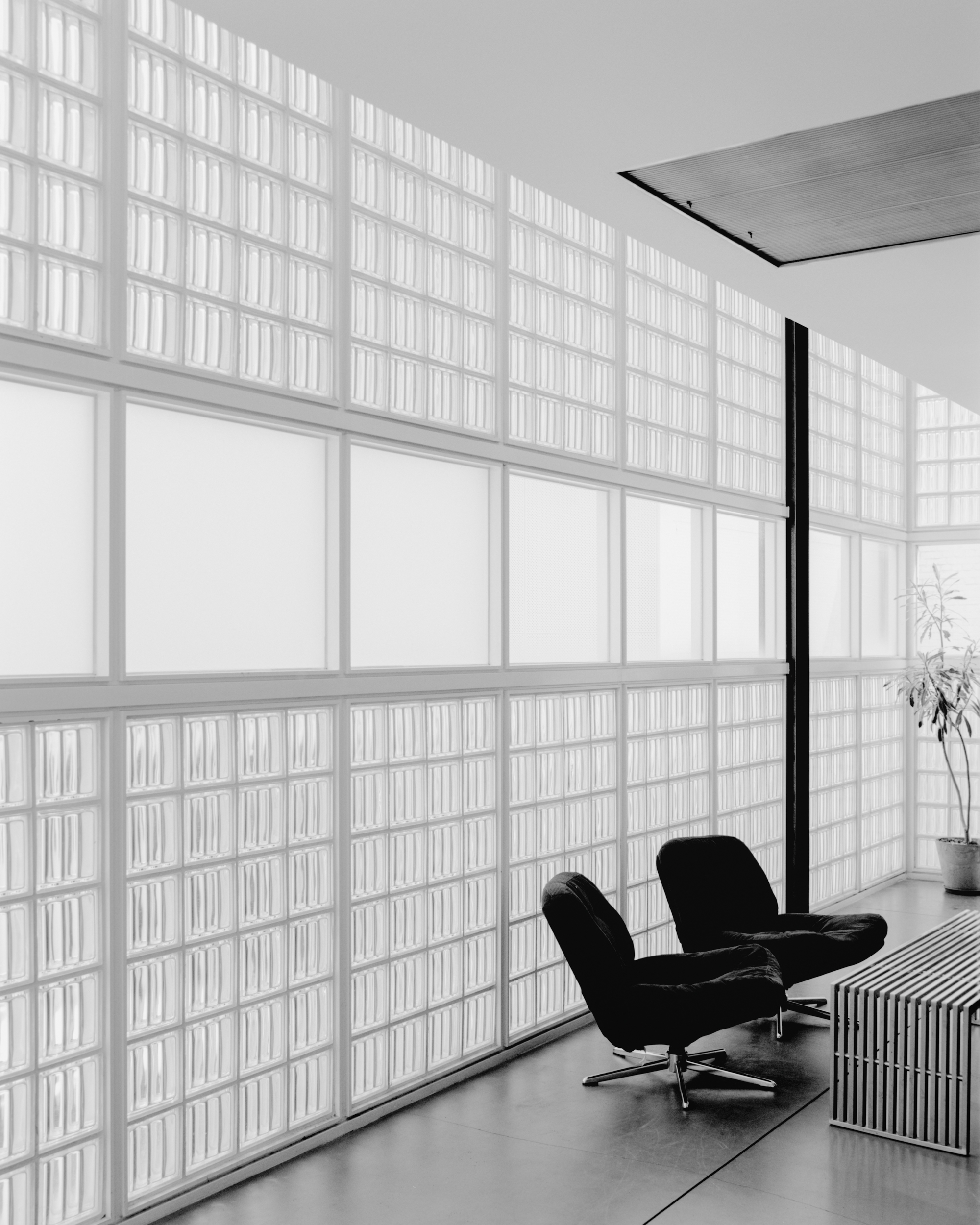
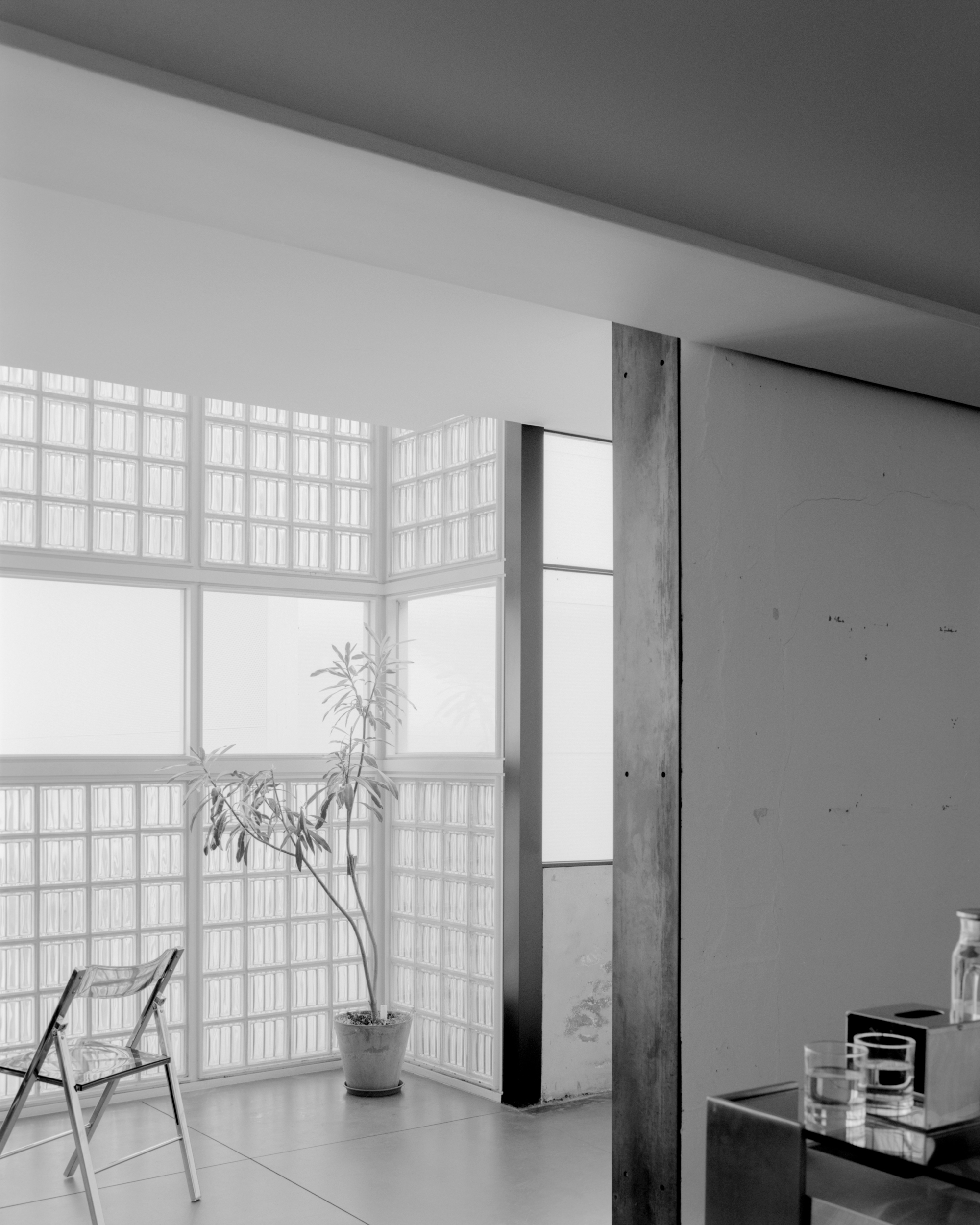
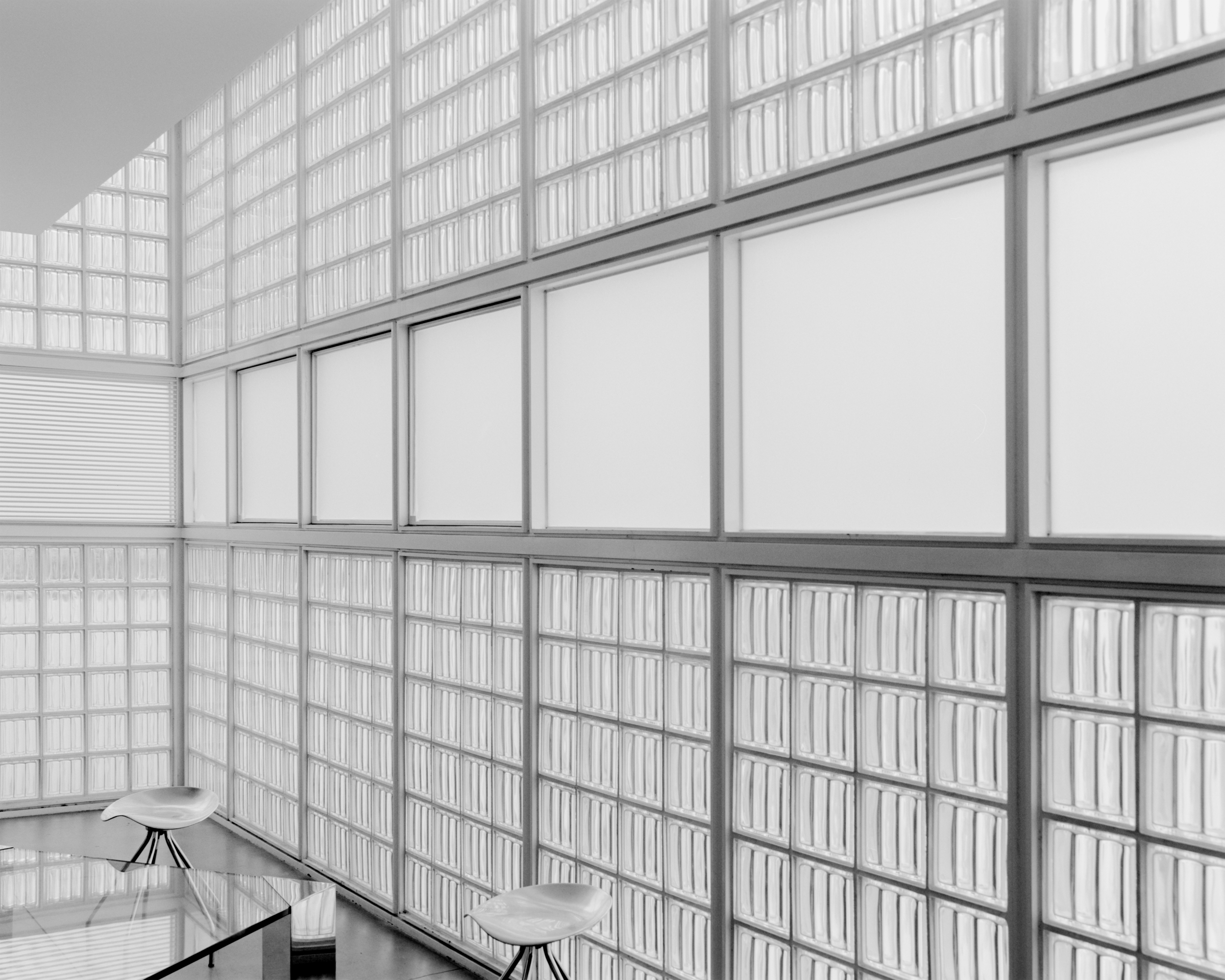
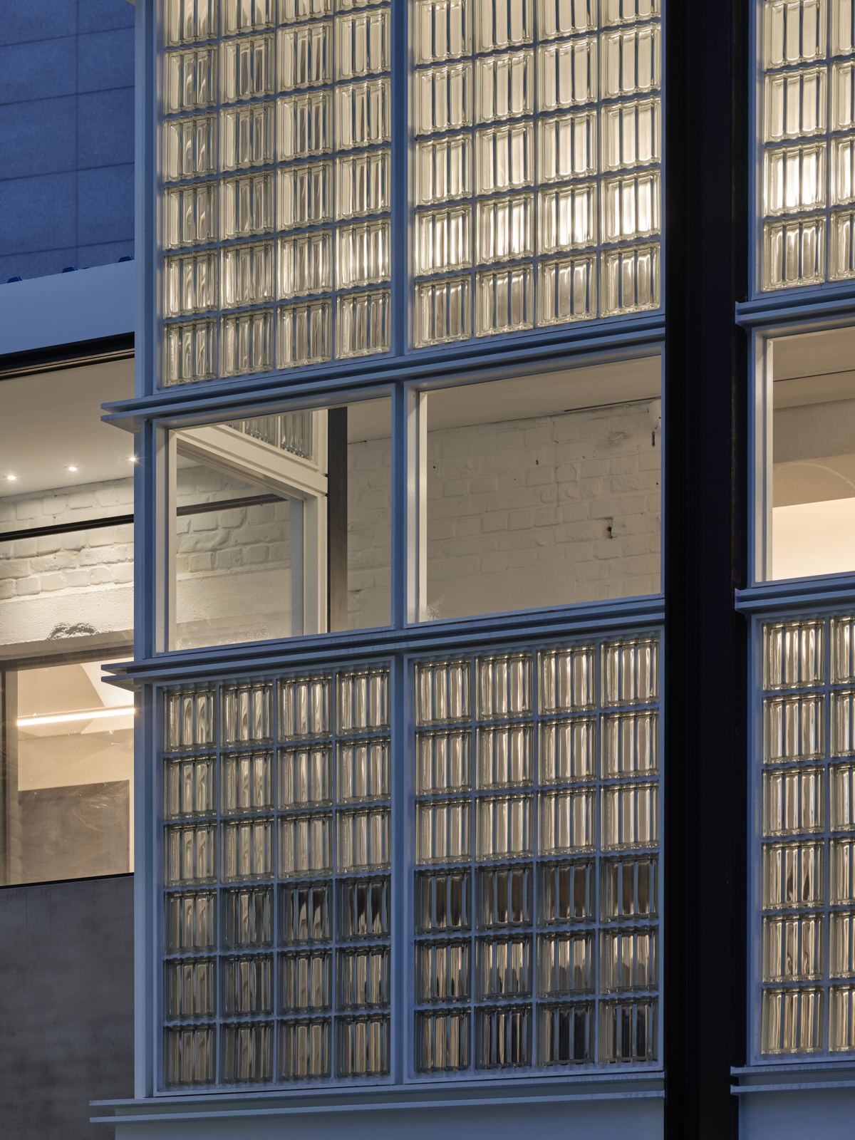
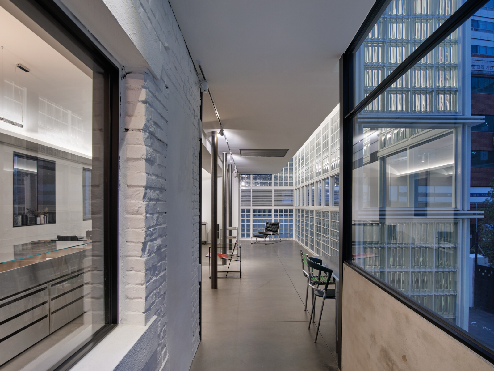
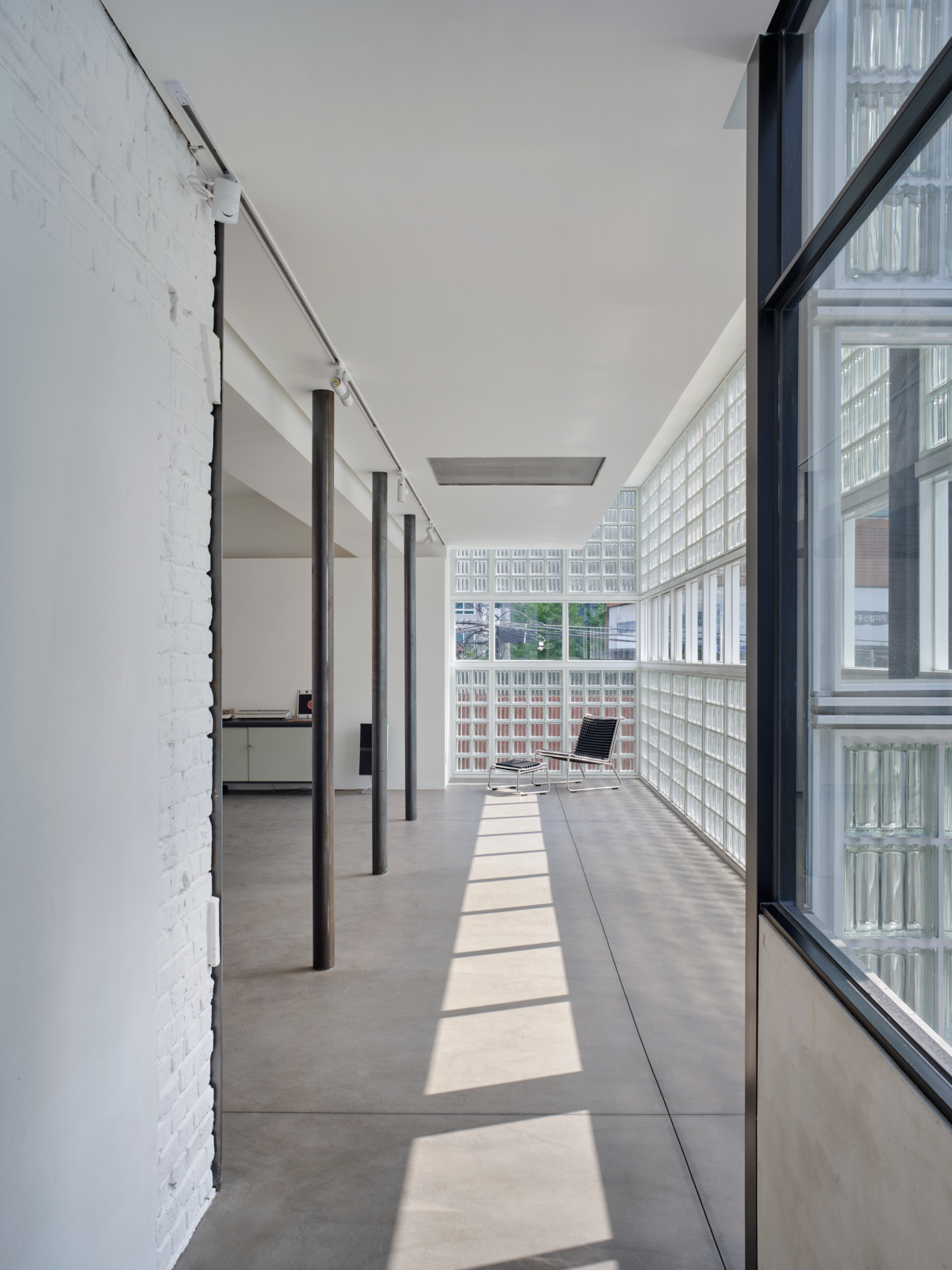
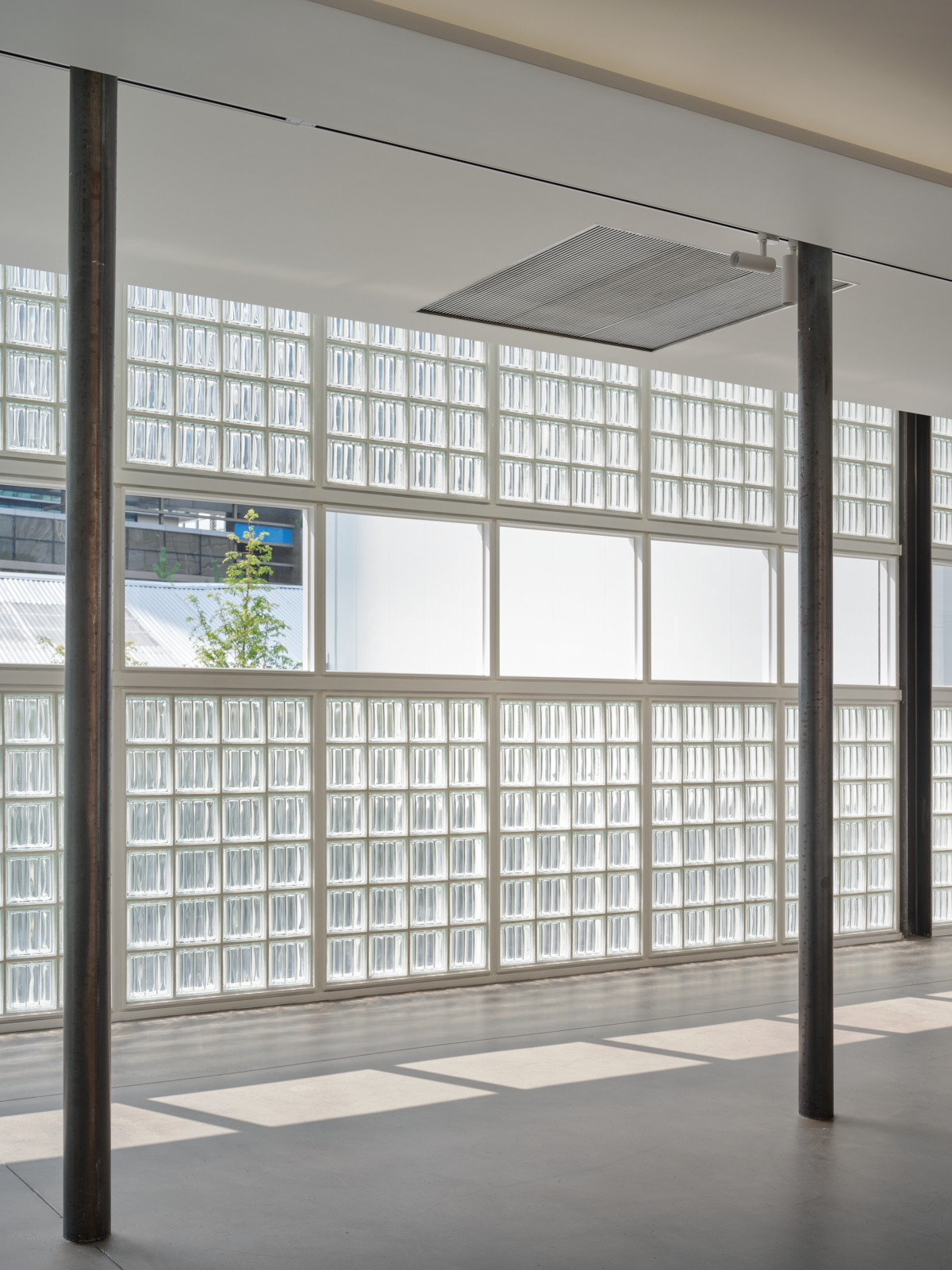
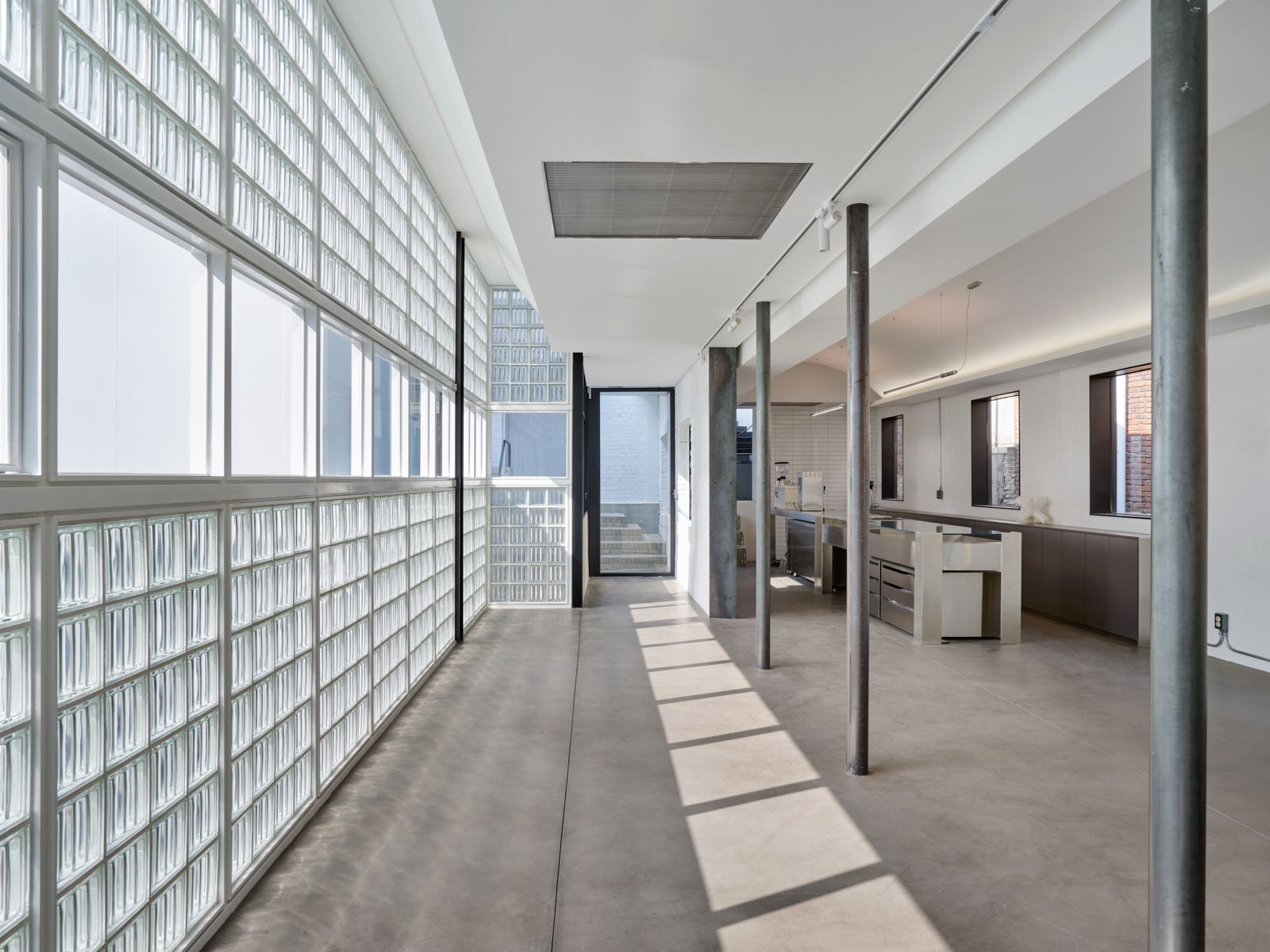
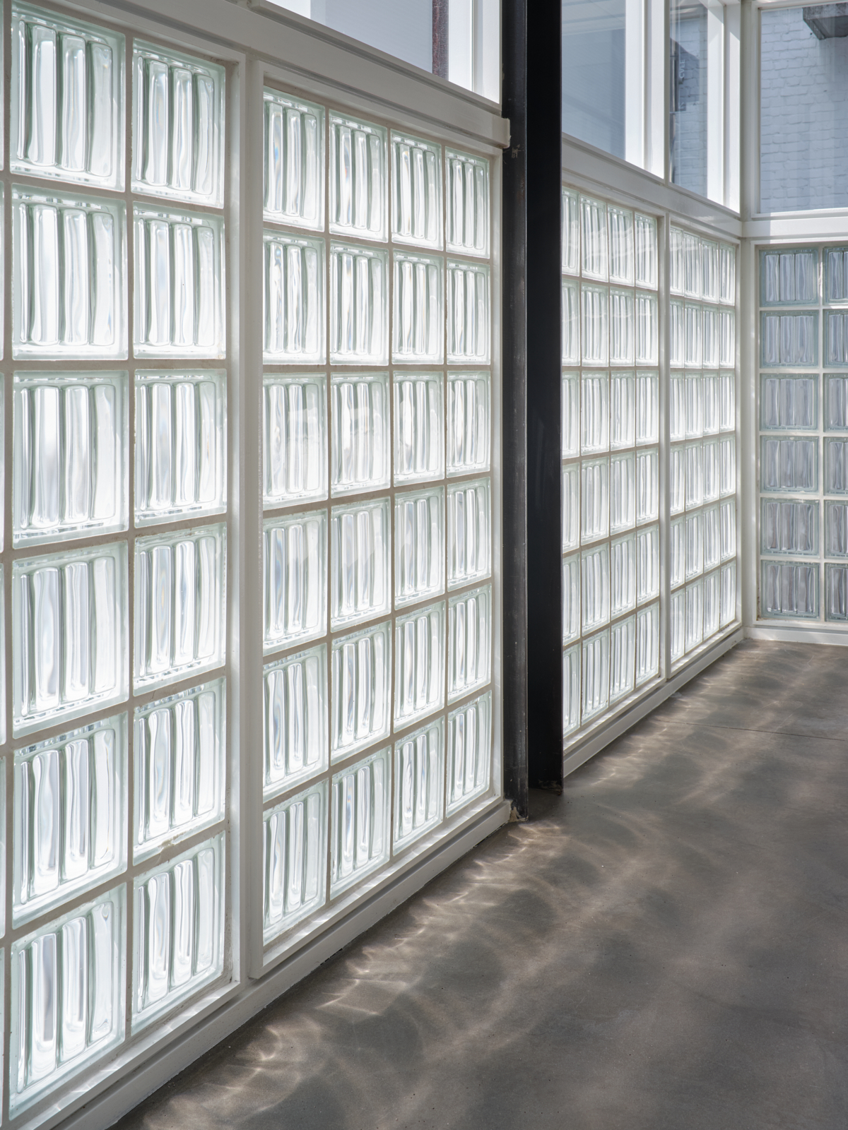
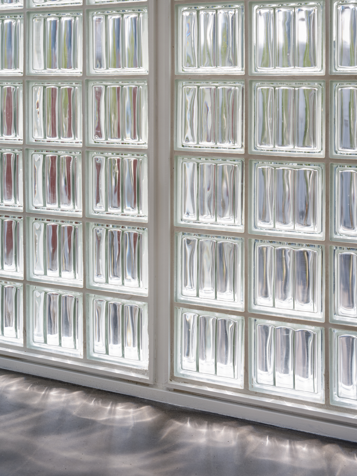
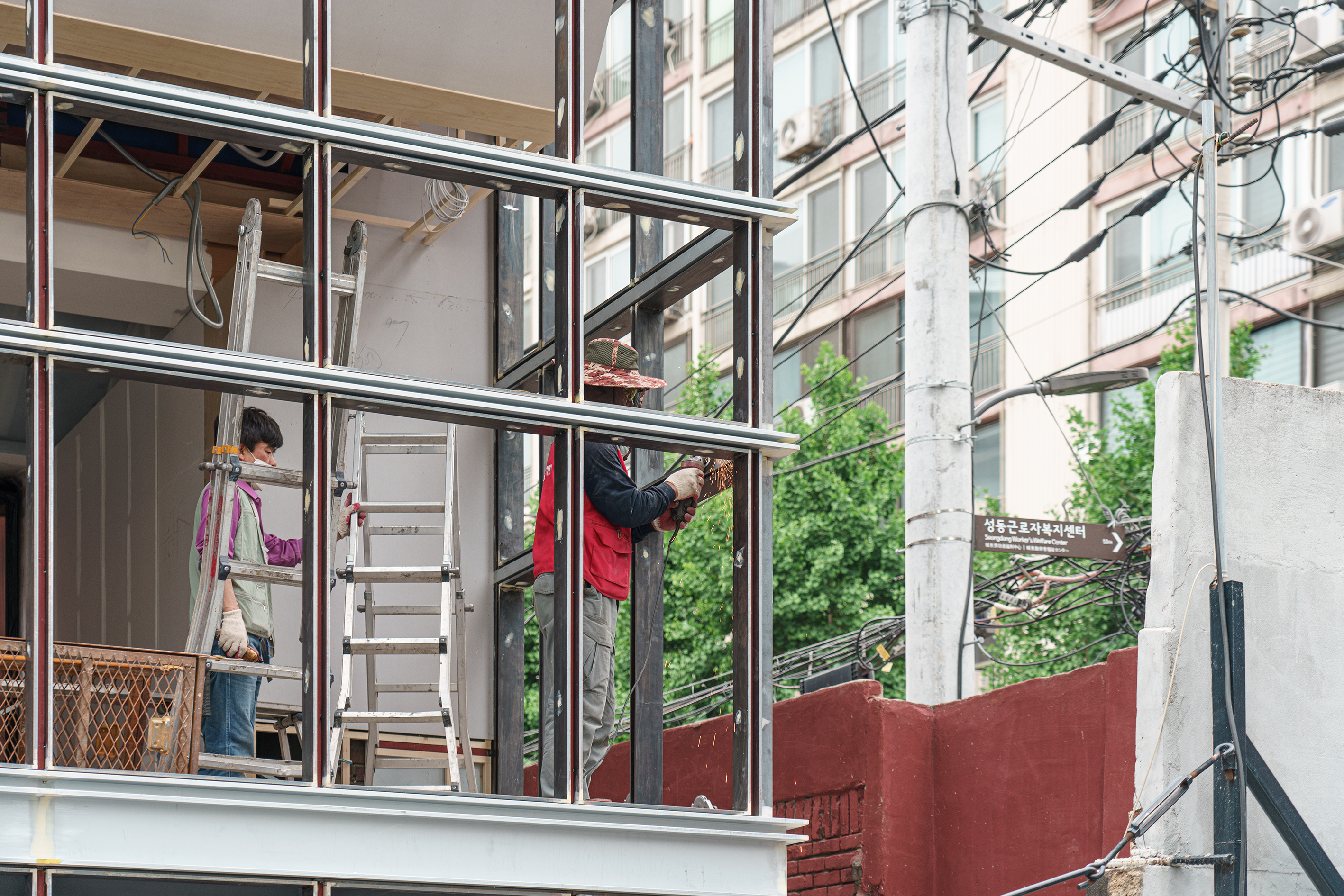
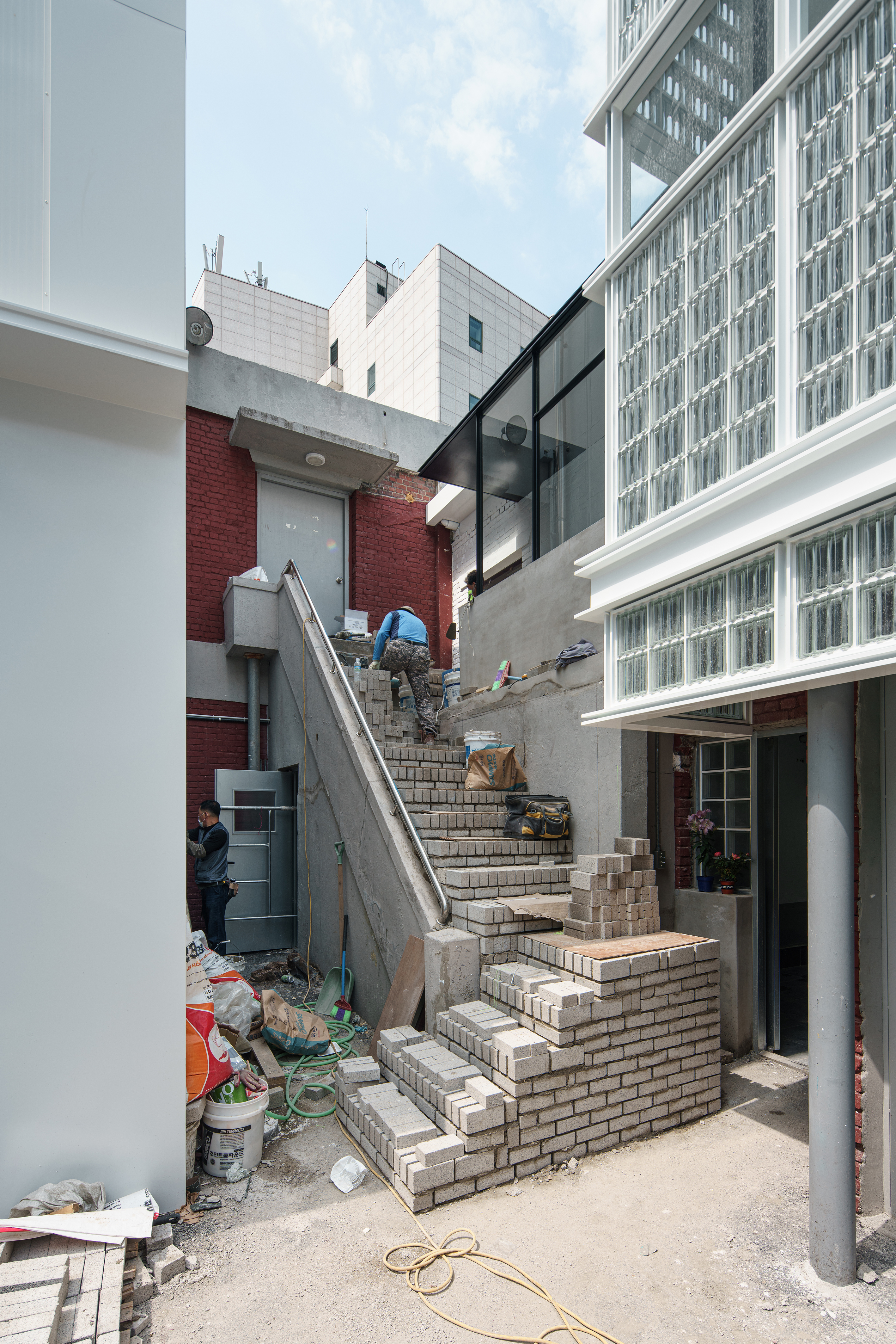
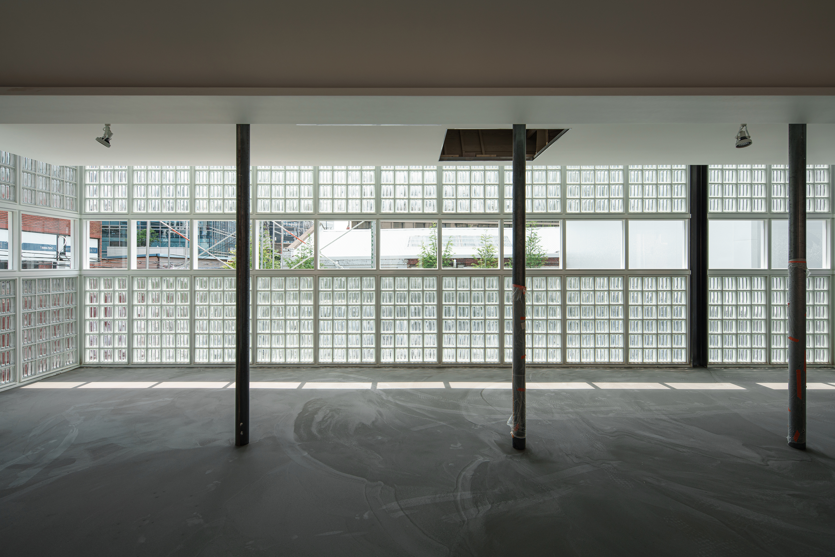
Use of glass block was a fixed option by request of the client. A famous project built in Paris in the 1930s* emerged when considering the combination of two main design elements, metal frames and glass blocks. We decided to lean on reasons and logics rather than senses. We completed a 10 meter long surface by repeating a module of 4×6 glass blocks inserted into repeatedly manufactured metal frame. The frames work not only as rulers to the module work, but also as structures to the facade. We could imagine replacing the insertion materials in the far future.
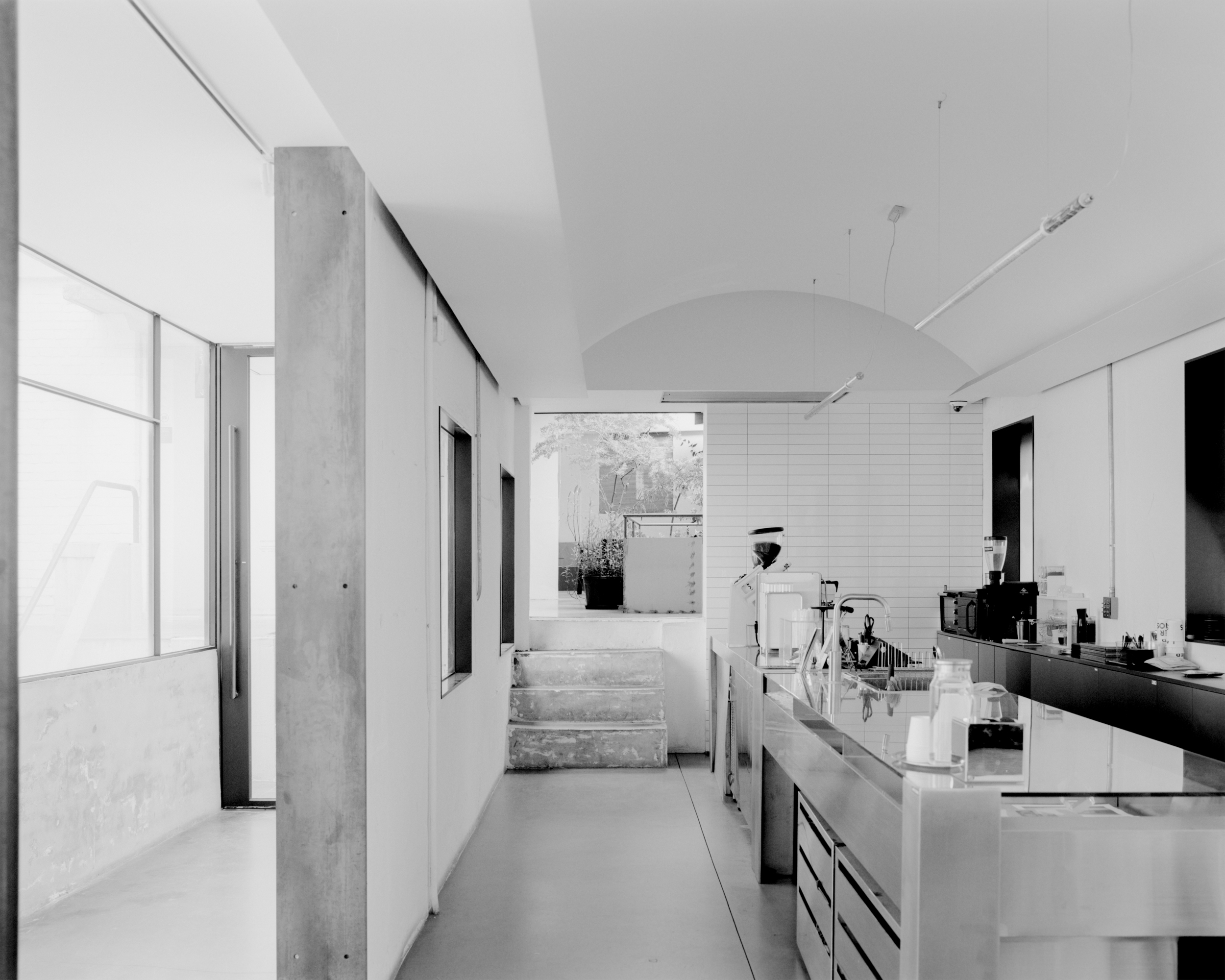
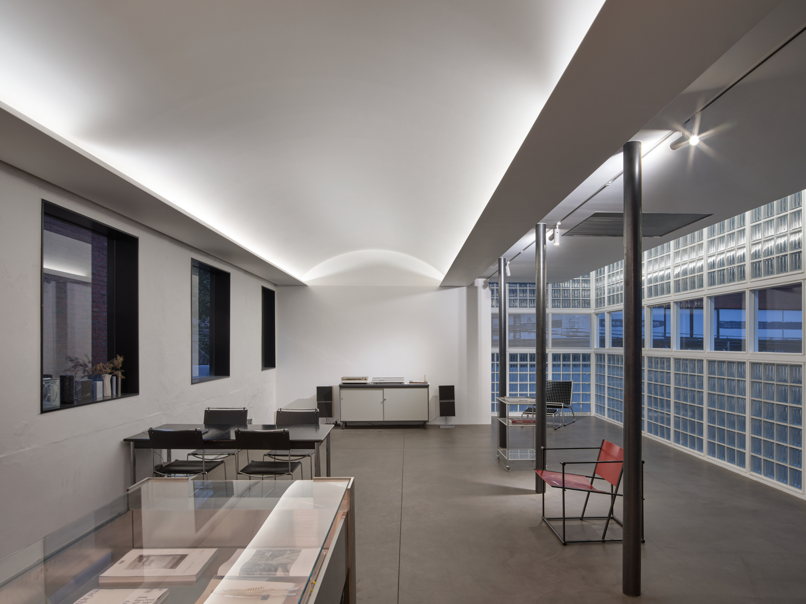
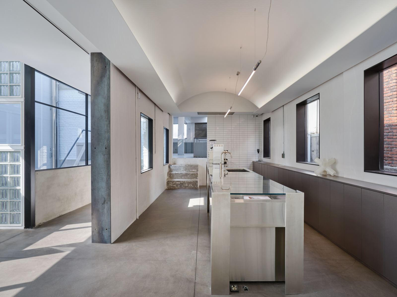
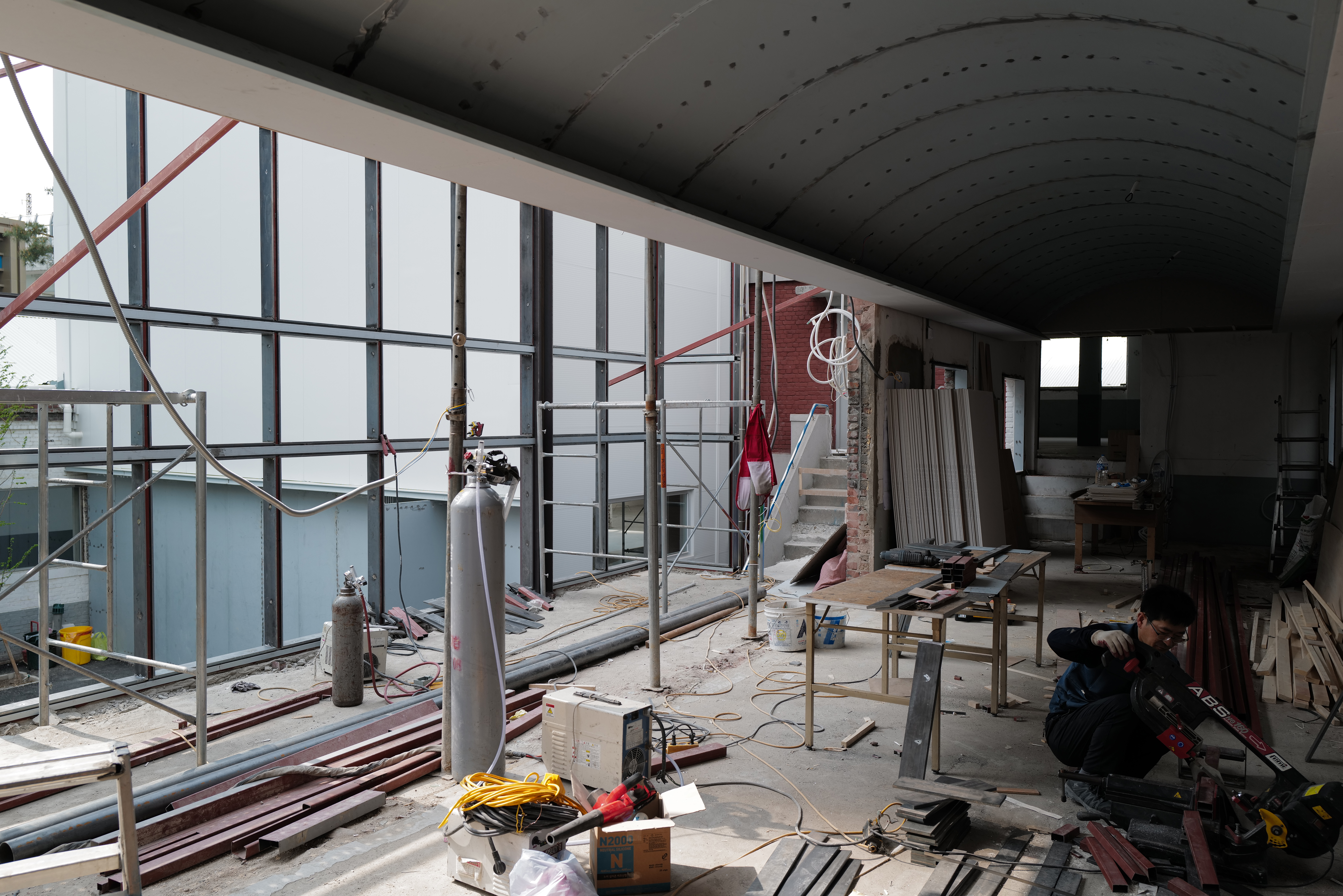
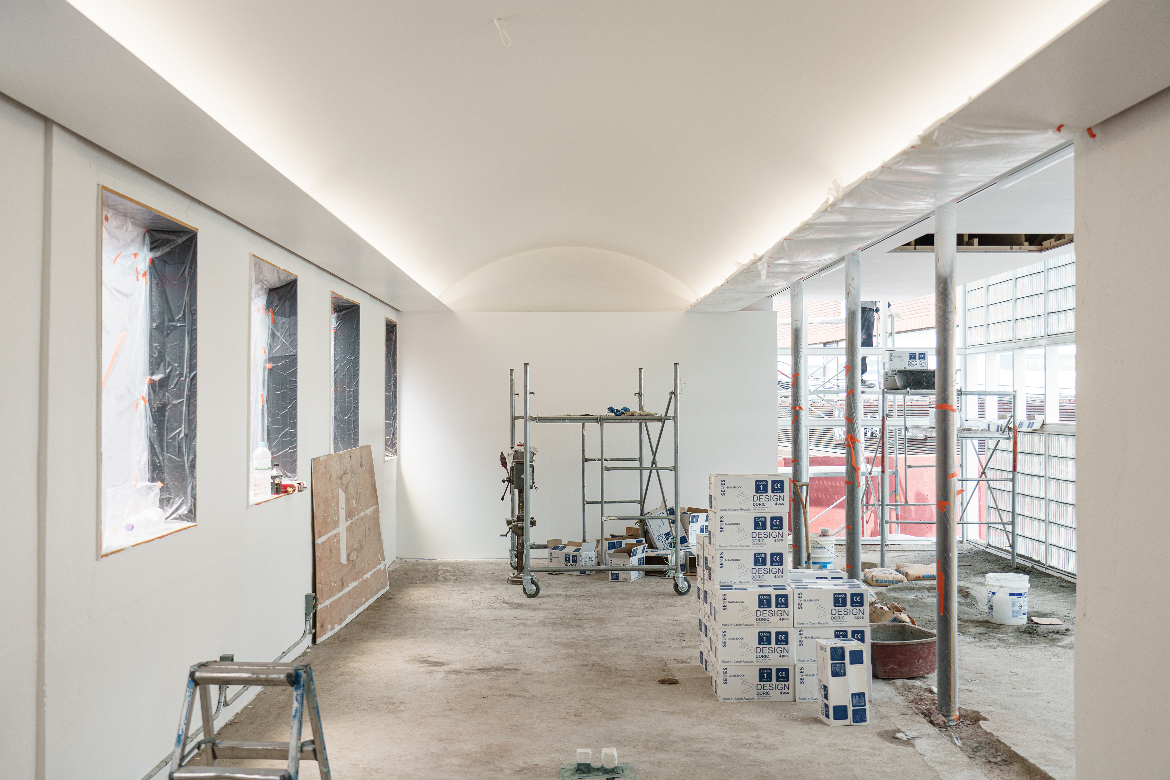
Along with the facade design, one of the biggest challenges was to create a sense of attractive space through ‘re-shaping’ the existing interior space elements. Prior to any decisions, we agreed to tear down the big wall that was crossing in the middle. For the change, we reinforced the structure with three parallel columns. Now we had two different rooms to design, running side by side.
First step was to give the first room a better planar proportion and a dramatic glass block effect. For the purposes we moved the entrance point further outside and elevated the ceiling to the maximum height. Visitors were now expected to be drawn towards the light coming from deeper inside.
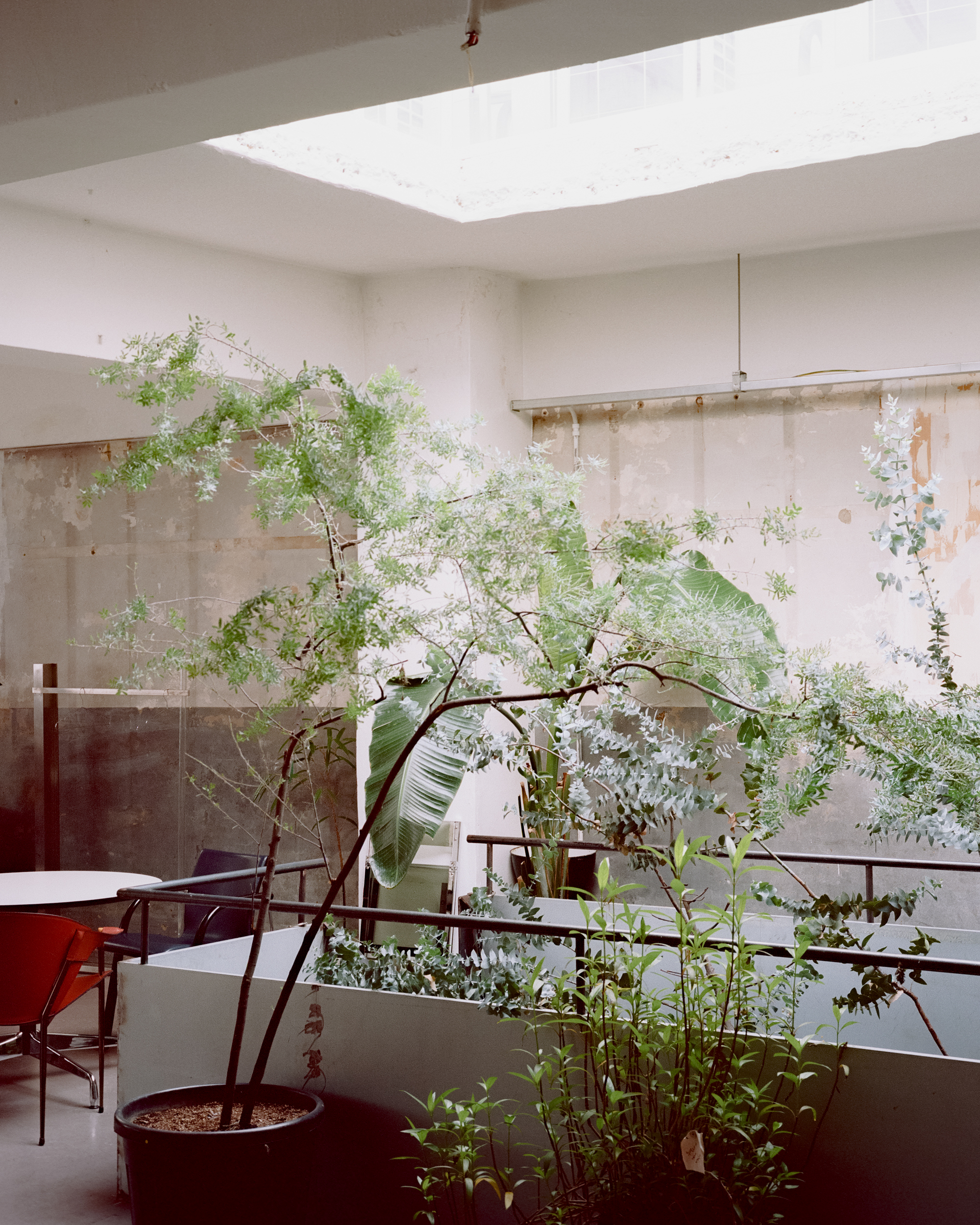
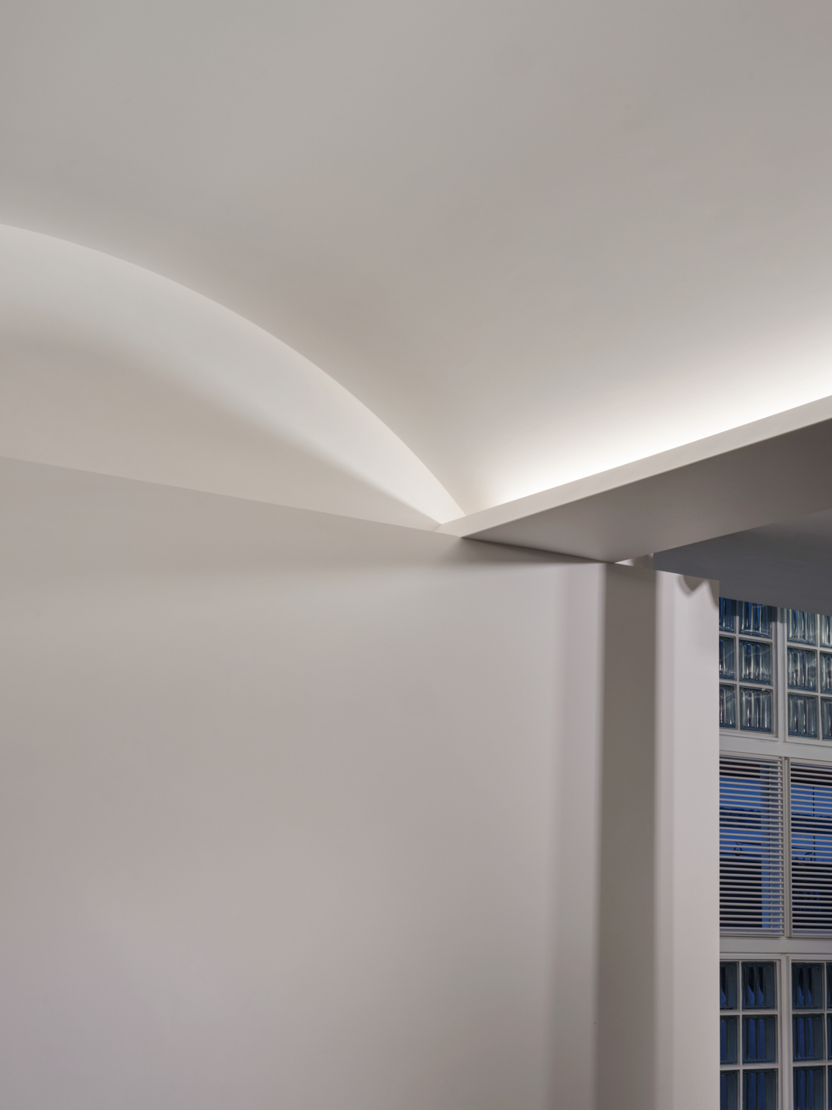
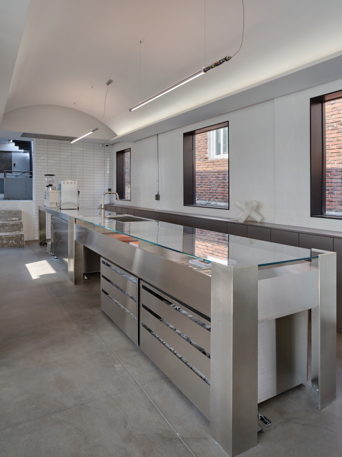
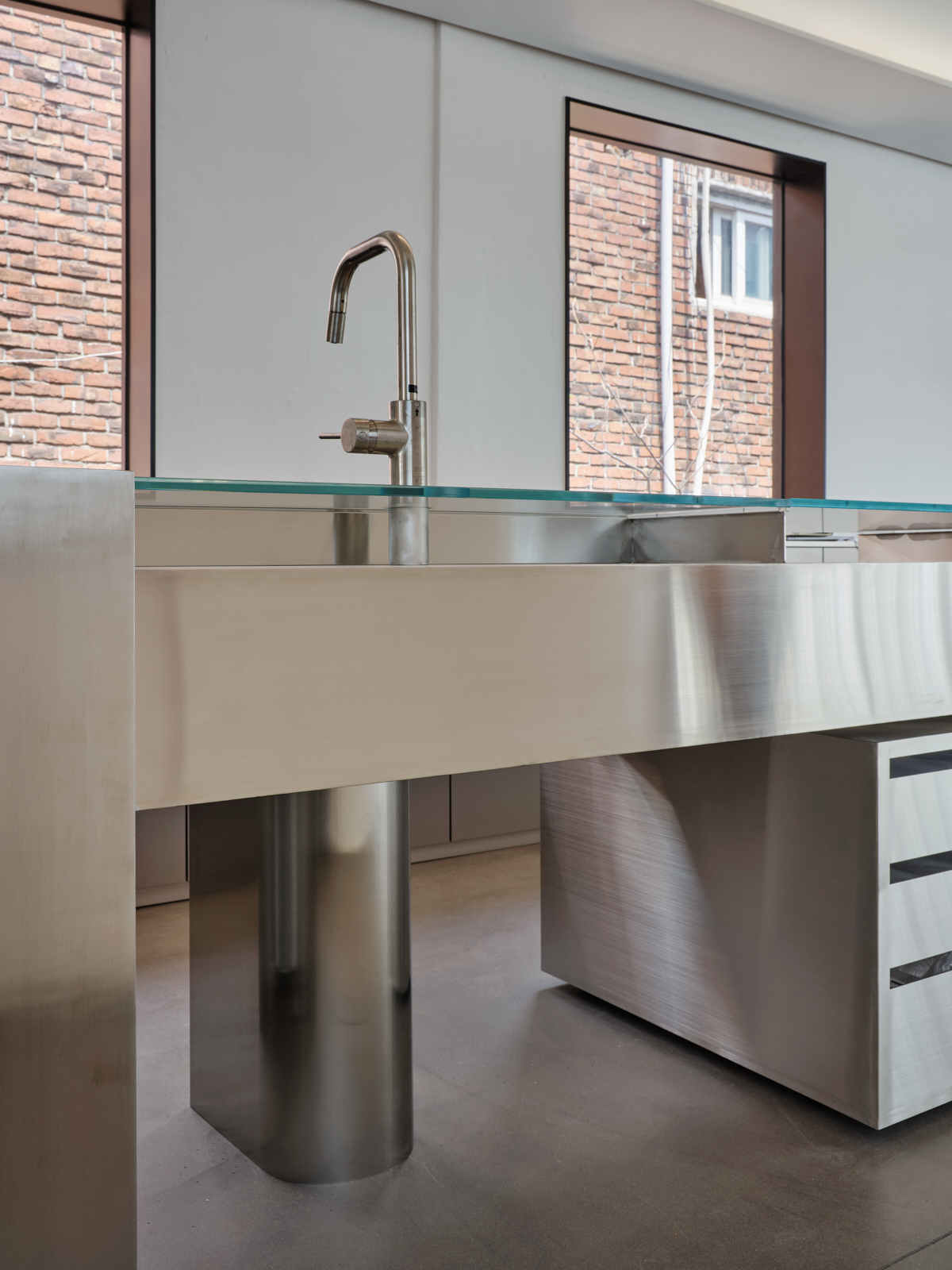
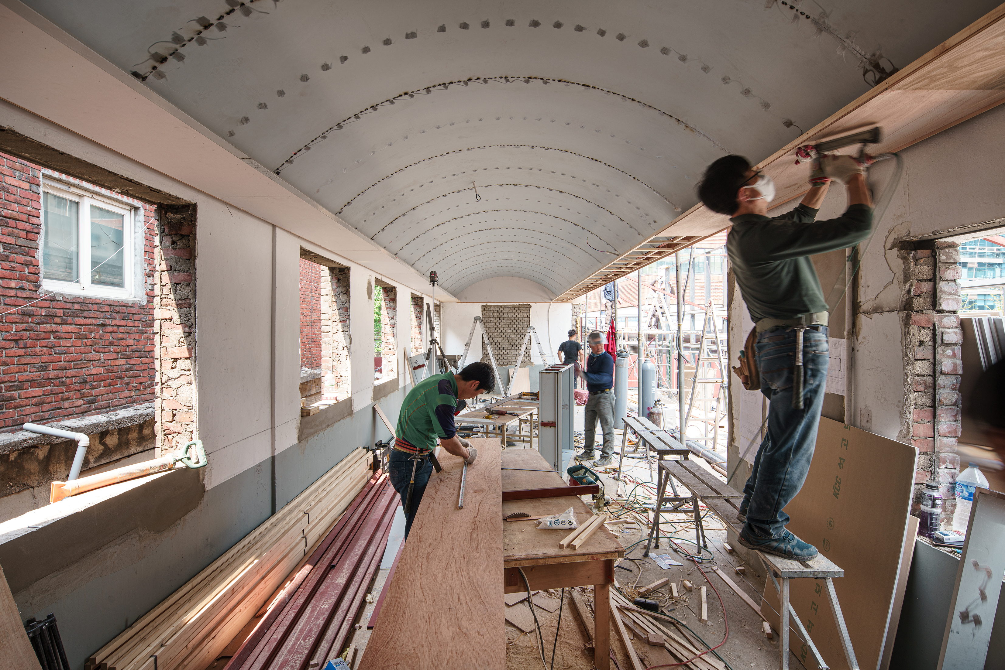
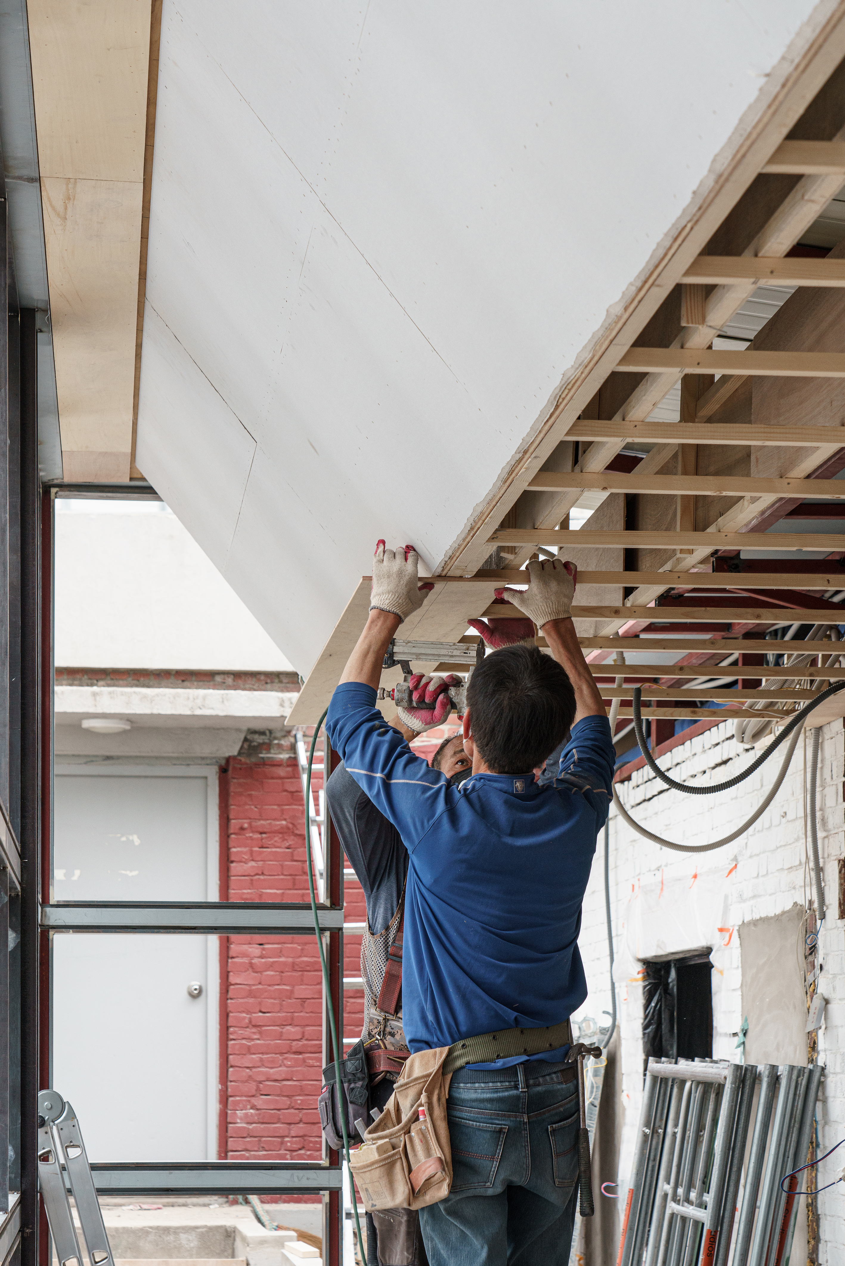
In the case of the second room, beyond the columns, we found no better solution than covering up every pieces of red square pipe ceiling trusses. We added a long vaulted ceiling hoping to draw and lock in glass block light into the space. Three columns in between are gateways to two different rooms. Different ceiling shapes with the columned boundary create changes in scenes.
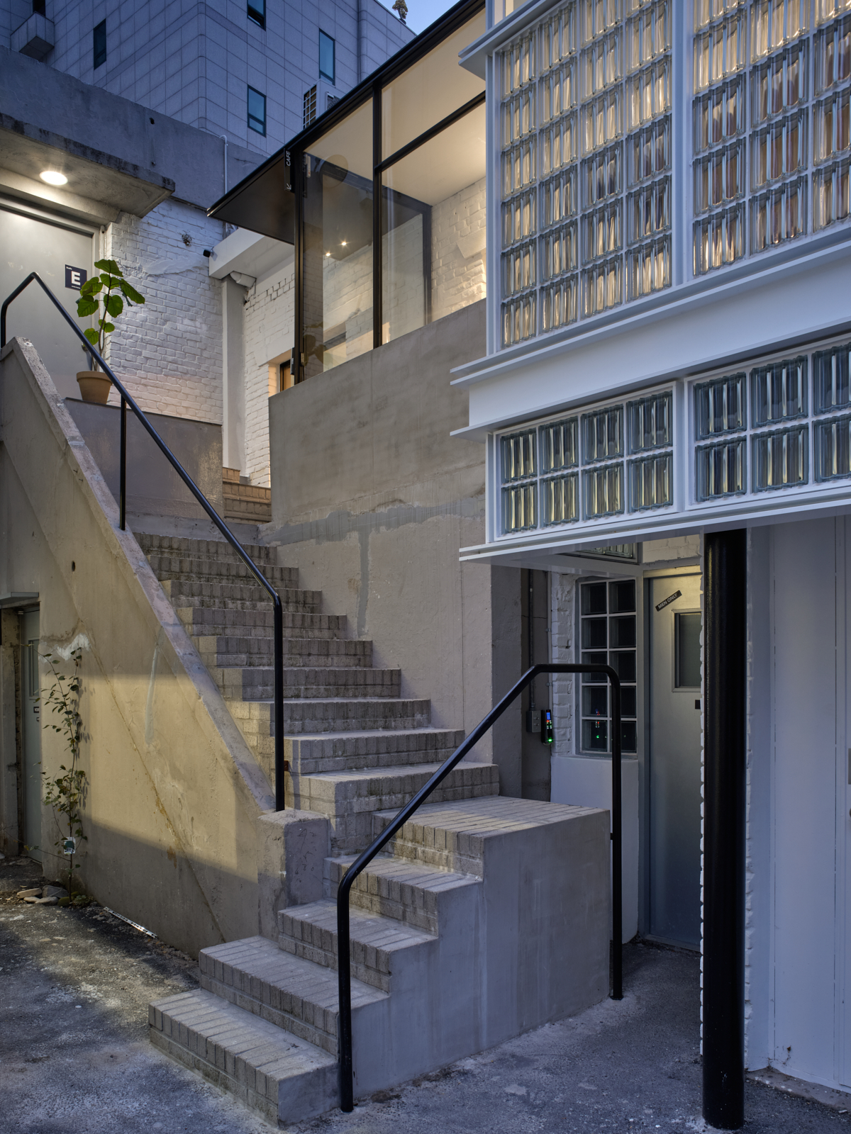
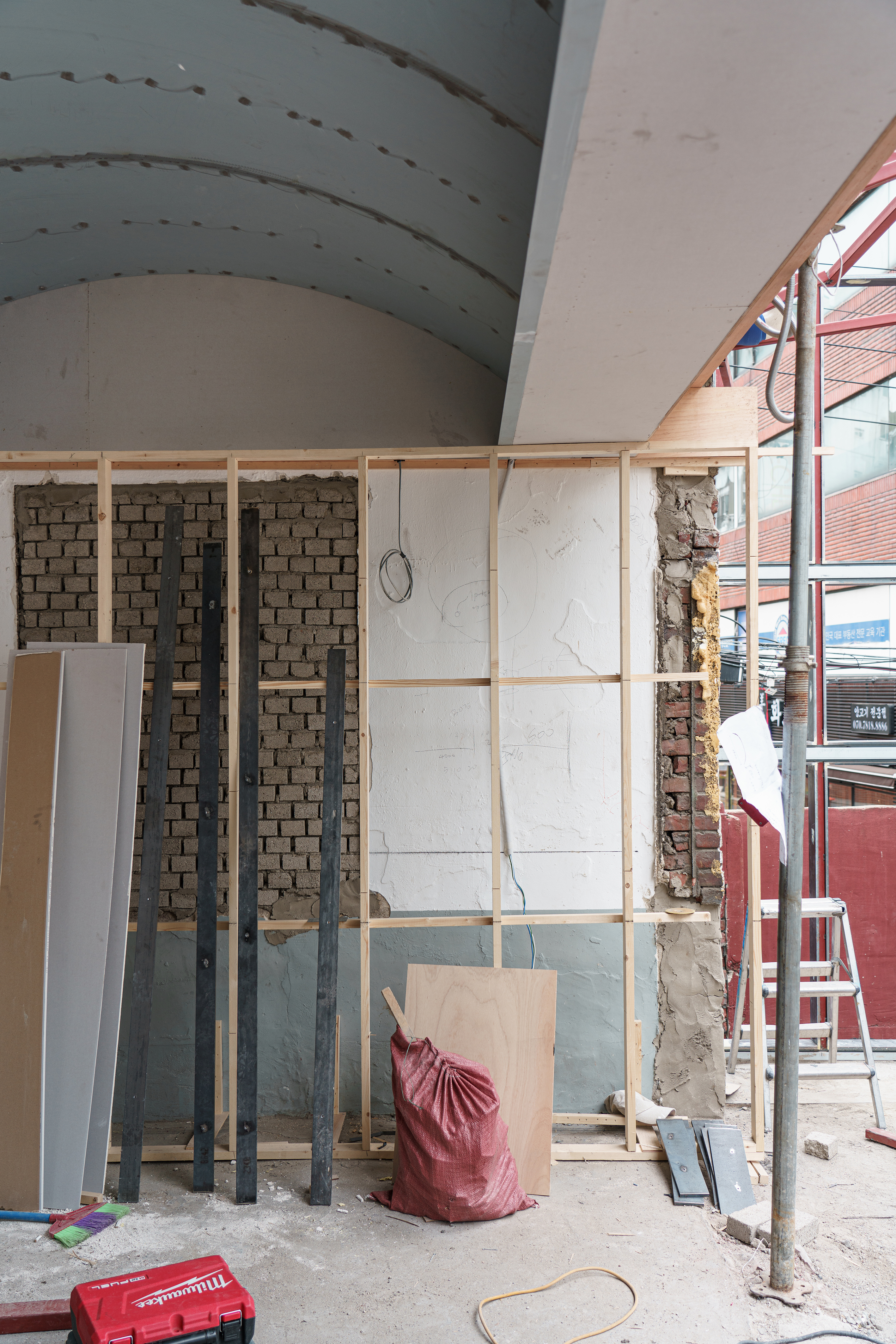
Remodeling project necessarily goes through reinterpretation process. Valuable difference is likely to be created by decisions on where to tear down and which part to keep the existing. The keeping part depends on the designer’s comprehension of the given building elements. Layer10 cafe building held more than enough potential atmosphere whereas had very little materials or forms to maintain. Therefore we chose to drastically add new layers of materials on many scenes, and change forms. But when putting new layers, we tried to magnify so called ‘rawness’ of original materials. We intended to leave rough joints when old and new met. When it came to the staircase outdoor, we revealed the mended trace instead of replacing it.
In most design opportunities, we seek ways to build something that is enough to be called a ‘place’ that becomes more familiar within time. This time, there were more issues to consider and handle. As a collaborative result of many talks with the client who was a professional photographer, we were able to build a collection of unique space scenes. We were hoping to create as many different slices of different spaces and backgrounds rather than a grand liaison of story, and that it would give more strange crisps to the visitors even after many repeated visits.
